Note: This is a guest post originally written by Pedro Medeiros. Pedro is a Brazilian artist and games developer, author of the lovely pixel art in games like Towerfall and Skytorn. Pedro is currently working on Celeste.

1. It’s Not Just Art, It’s a Puzzle
When I’m drawing I like to think that I’m solving a puzzle, each pixel meaning and communicating something. Having a few pixels to work with means that each and every one of them must be placed with more care than if I had a bigger space.
Thinking that the image I’m making is also a puzzle helps me because it separates my brain into two parts: one is focused on what I want to picture and the other on how I’m going to achieve that.
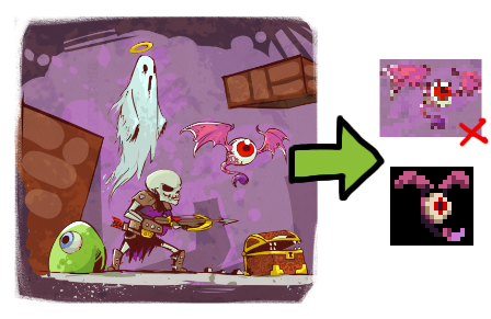
In the image above, converting that concept art idea into the in-game sprite was like solving a puzzle. I had to carefully choose what and how to show in that small space, otherwise I would just end up with that resized mess.
In this post, I’m going to try to explain some of my thought processes when approaching low-resolution Pixel Art.
2. Keep it Simple and Meaningful
When working in low-res it’s very important to choose what to show and what to leave to the imagination of the viewer. You won’t be able to show everything, you just won’t. Always try to choose carefully, taking away every bit of information that it’s not extremely important and focusing on the things that communicate what you need.
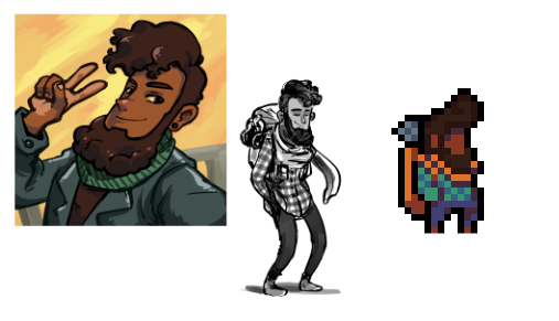
In this character from our game Celeste, I focused on his beard and hair because they communicate so much about his personality. I considered his scarf and backpack important too since they help convey that he is climbing a cold mountain. Theo is also a very relaxed person, so I made him in a laid back posture, by moving his torso one pixel back.
Normally I avoid doing dithered patterns in character clothes, but in this case, I made an extra effort to add it. Since Theo is sort of a hipster, I thought it was important to show his flannel shirt.
3. Simple Means Subjective

For me, the beauty of pixel art is that as an artist I’m not the sole author of the drawings I make, half of the work is made by the observer. When I look at this orange-haired character I see something specific in my mind: a female warrior, holding a battered shield, probably ready to go on an adventure.
But the cool thing is, this is not necessarily what you have seen. The moment you glimpse at a drawing like this, your mind starts to work and creates a clear vision of what that is. And that creative work you instinctively do is what makes this drawing unique, just for you.
I’ve seen many artists complain or get sad when they draw something and the viewer sees something else, “That’s not what I meant” -they say. In low-resolution pixel art, getting people to see exactly what you meant is very rare, if not impossible. As an artist, instead of fighting it, I try to embrace this and make the best of it. I intentionally make ambiguous pixels, trusting the viewer’s creativity to complete the drawing I started better than I could.
Almost as a side effect of this, every single pixel starts to have critical importance.

I made this little animation to show how much an image can change by just moving a few pixels around. That single-pixel makes the eye of the character say a lot, and when drawing in low-res that’s exactly what I want. Ideally, I want each pixel to have as much meaning as possible.
Sometimes I don’t know what a pixel should be, and that’s ok, as long as it can mean something. I really avoid just placing random pixels, even more so if they are around an important area, like the face of a character.
4. Keep it Simple
Working with constraints is already hard enough, so it’s best to avoid things that can complicate it even more.
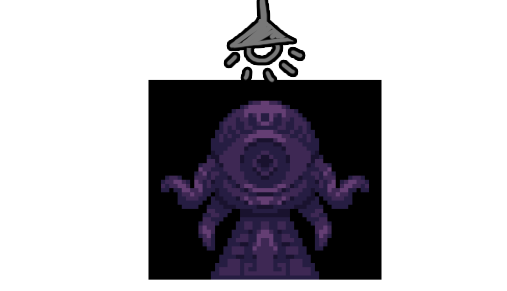
I try to keep the light simple: one direction and one backlight at most unless I really need a more complicated light for some reason. But be careful to not oversimplify. While making unlit shapes might work for icons and black & white art, it’s usually better to have a bit of light to show that the objects have volume and are not flat.
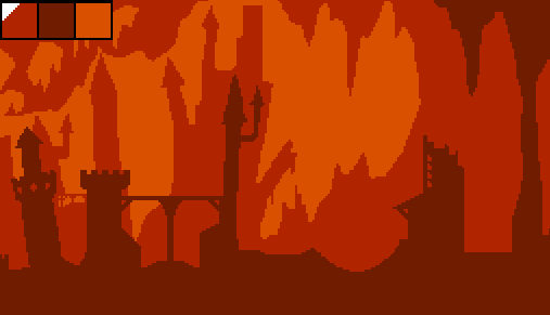
The number of colors is another point to think about when working. Keeping a low color count means that every single color you choose has a meaning and a reason to be there. Too many colors can make everything difficult to read and especially difficult to work with.

To keep things interesting, favor complementary colors and other high-contrasting combinations. Making everything in a single hue usually makes for very boring images.
5. Use The Right Angles
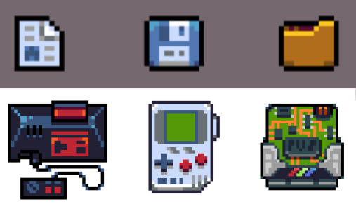

Pixels are squares and there’s not much we can do to change that. What we can do is use the fact that they are squares and get very sharp lines if they are horizontal or vertical. I always try to use as many as 90 degrees angles as possible, so the pixel shape helps me to convey that corner.
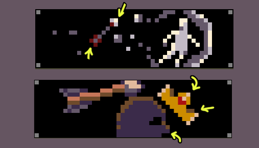
Another good use for the pixel shape is for pointy things. Pixels are very very pointy, and you can use that for sword and arrow edges, just rotate them 45 degrees and use that corner!
6. Remove the Outlines
I love outlines, especially if they are just outside the sprite. Celeste and Skytorn have a bunch of those and they are great for separating background and important sprites.

But sometimes you just won’t have space. In very small resolution you will have to ditch a lot of things to show the things you think are critical, and the outline is one of the first things to throw away. They are nice, but sometimes it’s just impossible.
Solid shapes with contrasting colors are the way to go in extremely low resolution.
7. Using the “Camera”

If you are animating you don’t need to have an object in the frame for it to exist in the mind of the viewer. For example, in this flower animation you never see the water coming out from the watering can but you don’t need to see it, it’s implicit.
The same thing is valid for the flower leaves.
The camera moves up, but the flower still “exists” down there. You can use this technique to show a lot of stuff in a relatively small canvas, just show it once, then move the camera.

Again, this is also true when you change the scale of something. If you look at this:

I would find it difficult for someone to assume that it is a letter. But since I show it first your brain registers it as a letter, then I can even put a little gray square down there and the brain will register it as an envelope. To sum it up: things need to exist in people’s minds, not in the image.
8. Fight the Resolution
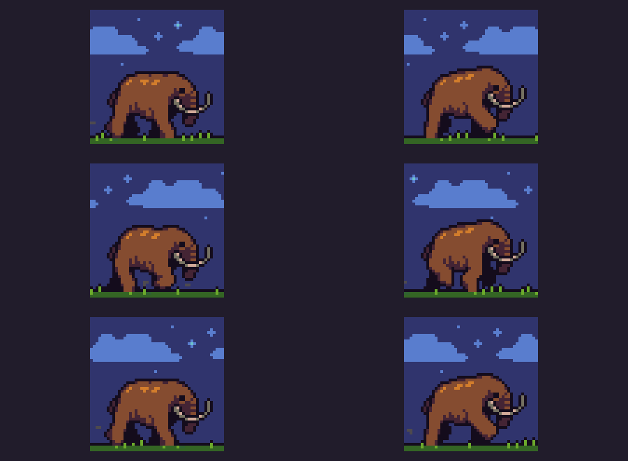
It’s important that while I like working in low resolution, I try to constantly push the resolution to the limit. This is the mindset that was used by people who worked in old games and I try to apply that same mindset to my work today.
9. Sometimes it Just Doesn’t Work And That’s Ok
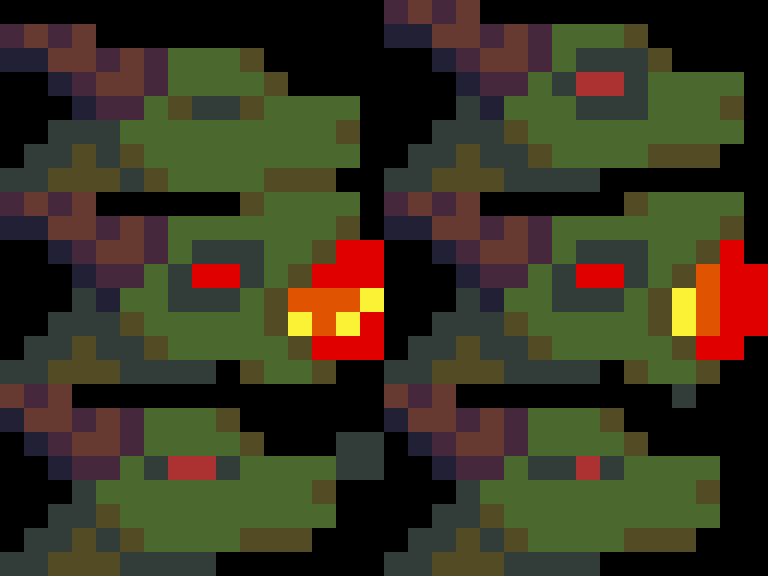
Like I said earlier, working in low resolution is as hard as solving a puzzle and sometimes it just won’t work. When I started that dragon, for example, I wanted to show its whole body, but I just couldn’t do it. I tried a lot, started again at least five times until I noticed that I just couldn’t do it.
And it’s OK when that happens, you just need to figure out an alternative. In this case, I decided to zoom in and show only the fire breathing, and I’m glad I did it! I would rather make a cool dragon head than an ugly full-body image.
To summarize with a very corny metaphor: when drawing in low resolution you can’t choose the arena, but you can pick your battles.
Here are some of the pieces I drew for the Pixel Kit and where you can see the techniques above being applied.

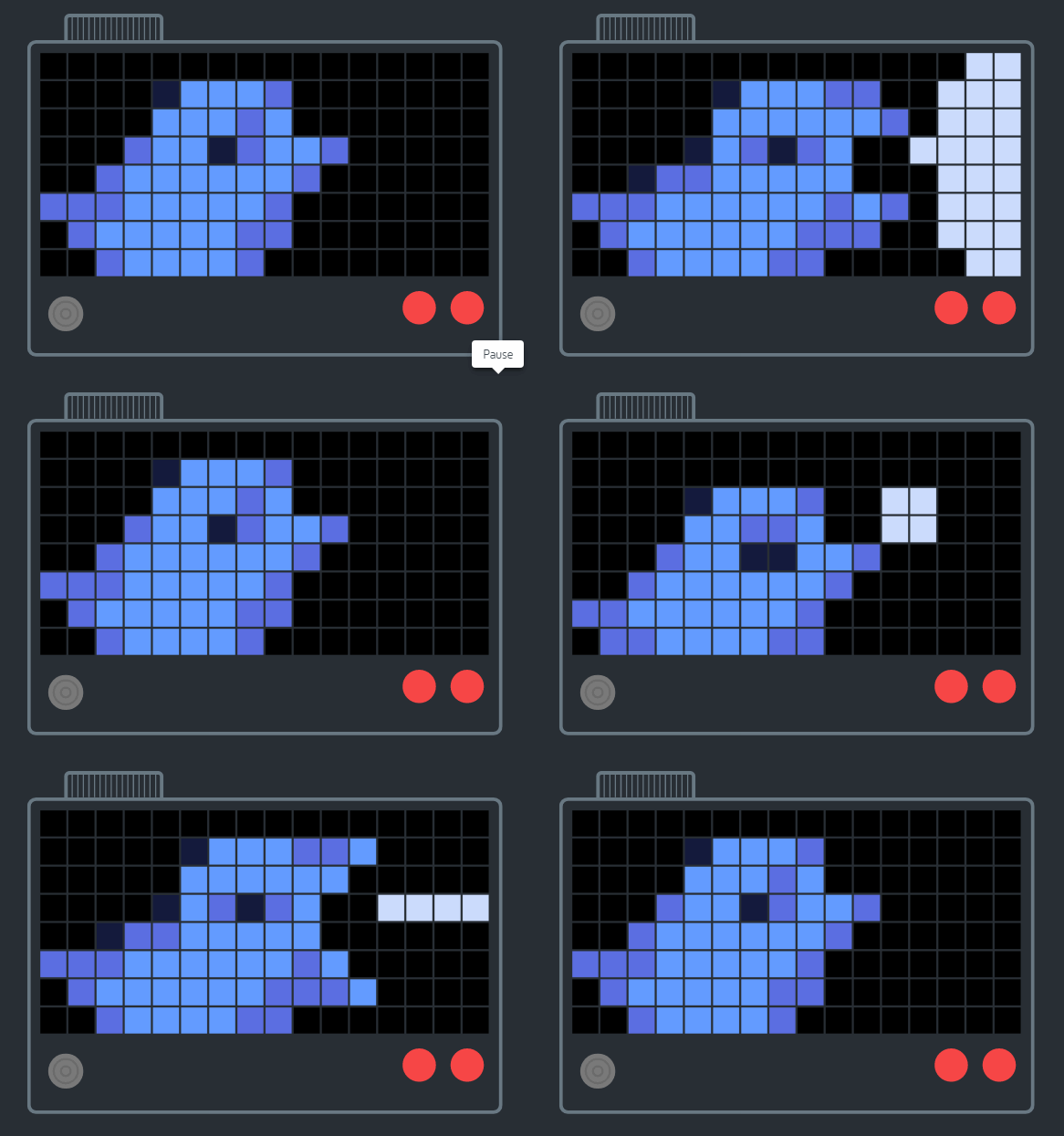
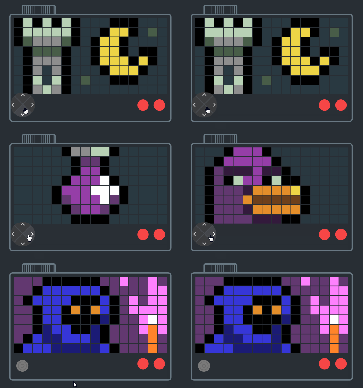

And that’s what I got on low resolution, good luck!
