A new trend is starting to emerge in the world of design that focuses on that delivering less, not more. Transparent or “see-through” technology has started to turn heads. Emerging brands are setting themselves apart by opting for demystified and open products, going against the status quo of elusive and closed devices.
Today we take a look at some of our favourite classic and new opaque objects and we take a deep dive into the “why” of transparent tech.
Gameboy Color

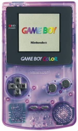
We begin with one of the most iconic handheld consoles of all time, the Gameboy Color.
This 1998 handheld was one of the first to introduce a colour screen, and is one of the best selling video game devices of all time.
Its transparent purple case is what makes it so unique, exposing a generation to the motherboards and components that bring their gaming experiences to life.
Original iMac

In recent decades, Apple devices have garnered a reputation for being “closed” with locked proprietary software and hardware.
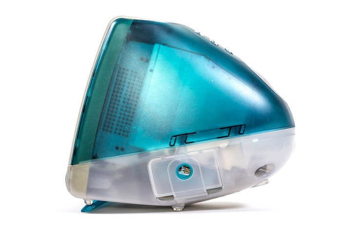
1998 however, saw the release of one of the most influential computers of all time; iMac G3 and with it a colourful transparent shell, allowing owners to peak inside the components that bring the computer to life.
Whilst being Apple’s most famous transparent design, it is certainly not the first.
Mac SE/30

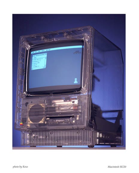
The Macintosh SE/30 was one of the most famous of the classic Mac series and was released cover in the famous cream case. However, in 2009, images began to surface of a transparent version of the computer.
It was later revealed that 10 of these beauties were created run out of the mold before the rough texturing was added. They were used to make sure that all the internal parts fit properly before signing off on production.
This stunning piece deserves to be in an art museum.
Nothing ear(1)

Beginning with a recent high profile gadget, the ear(1) is the first product launched by OnePlus co-founder Carl Pei as part of his new “Nothing” brand.
The company had been building huge anticipation on their first product since January 2021 and what was revealed were beautifully clear and simple earbuds.
Transparency is at the heart of the product: the ear (1)s have a clear “stem” that lets you peer at their internal components, and the unique charging box has an opaque lid to keep the buds in view at all times.
The transparent nature of the product is what sets it apart. Had Nothing opted for a more conventional stem colour instead, these earbuds would look just like Apple’s AirPods Pro or any number of competitors
ThermalTake

This beautifully expansive PC brick is the ThermalTake Core P5, a transparent PC build that is as beautiful as it is open.
The transparent, open-air nature of the case signals a shift in how we perceive what a PC brick should be. Rather than being seen exclusively for power, the beautiful attention-to-detail is what really captures us here.
Its classy leaves behind the concept of “PC Case” and moves more towards the area of mount or pedestal. It is a thing of beauty.
Kano PC

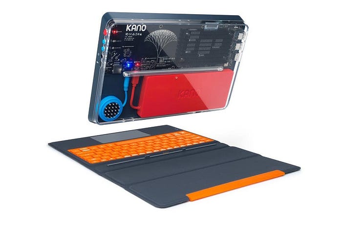
Last but not least, we have our wonderfully crafted Kano PC.
The Kano PC is the best first computer. A powerful and modular 2-in-1 computer at one end, but a beautifully crafted device at the other.
The transparent nature of the Kano PC case is an invitation to the user to explore the intricacies of how the computer operates, highlighting each colourful component and allowing the user to admire the computer in which they themselves have built.
The see-through build is the perfect allusion to the core Kano beliefs: Open and Transparent technology.
Why Transparent?
Metaphorical
In many cases, the emergence of transparent technology can be seen as a physical metaphor for the message or mantra a brand is trying to exude.
In the case of Nothing, for example, the brand is heavily promoting the ideals of trust, integrity and transparency in the technology industry and by having a physical product literally represent this is a great method for building awareness.
Design and Openness
Traditionally speaking, PC towers weren’t considered “works of art” or items that people would invest time and effort into making look pretty or aesthetic.
However, as of late, more PC cases are built to reflect the performance power of one’s computer and turn more and more into things humans invest time and effort to actually make them look good.
There is also a sense of beauty in the open nature of these devices. For decades, companies like Apple were revered for the minimalistic, “closed” nature of their product design. Devices were made to feel like magic creations, rather than technical mastery.
There’s an argument to be had for beauty in transparency. In the case of design, it’s providing the full disclosure on processes and components to customers in a way that’s clear. And in particular, about the things that matter the most to them.
Educational
Relating closely to the aforementioned principle of openness in design, many brands have introduced transparent devices as an educational tool, such as our very own Kano PC.
By exposing the computer mainframe at the back of the device, the PC clearly and openly indicates all the working parts and components that bring it to life. Beauty in design but also educational.
The transparent technology revolution is only just beginning. What are your thoughts on see-through technology? Are there are products we’ve missed? Why not get involved in the discussion on our Kano Discord Server .
